
In today’s fast-paced world, visual communication is more critical than ever. Whether you’re a teacher, student, or professional looking to make a poster for educational purposes, it’s essential to understand the best practices and strategies to maximize its impact. With the help of powerful tools like those available at StoryboardThat, anyone can make a poster that’s visually appealing, informative, and engaging.
This article will delve into the key elements of effective design, such as typography, color schemes, and layout, and provide practical tips for designing posters that stand out and achieve desired educational outcomes.
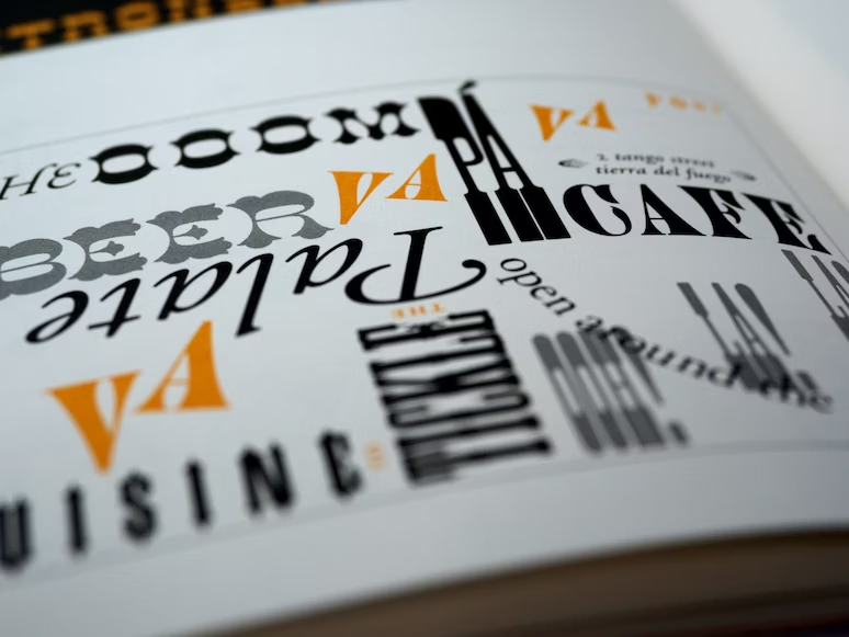
Typography: The Art of Text
Typography is the art of arranging text in a visually appealing and legible manner. When designing an educational poster, choosing the right font, size, and style can significantly impact its effectiveness. Here are some best practices for typography in poster design:
- Select a legible font: Choose a font that is easy to read from a distance, such as sans-serif fonts like Helvetica, Arial, or Calibri. Avoid overly decorative or script fonts, as they can be difficult to decipher.
- Use hierarchy: Vary font sizes and weights to create a visual hierarchy, with the most important information being the largest and boldest. This helps guide the viewer’s eye and ensures they grasp the key points quickly.
- Limit font variations: Stick to two or three different fonts at most to maintain consistency and avoid visual clutter.
Color Schemes: Creating Visual Harmony
Colors play a vital role in setting the tone and mood. To create an aesthetically pleasing and cohesive design, follow these guidelines for choosing and using colors:
- Use a limited color palette: Select two or three primary colors and use them consistently throughout the design. This creates a sense of unity and makes the design more visually appealing.
- Consider color psychology: Different colors evoke different emotions and associations. For example, blue is often associated with trust and stability, while red can signify urgency or excitement. Choose colors that align with the message and tone of your poster.
- Ensure legibility: Make sure there is sufficient contrast between text and background colors to maintain readability. Dark text on a light background or vice versa is usually the safest choice.
Layout: Organizing Information Effectively
A well-organized layout is crucial for making an educational poster easy to read and understand. Keep these tips in mind when arranging text, images, and other elements on your poster:
- Divide content into sections: Break up information into clearly defined sections using headings, subheadings, and bullet points. This makes it easier for viewers to process and retain the information.
- Use white space strategically: Don’t overcrowd your poster with too much text or imagery. Ample white space helps create a clean, uncluttered appearance and allows the viewer’s eye to rest.
- Balance text and visuals: Incorporate relevant images, charts, and graphs to support your text and make the poster more visually engaging. However, be cautious not to overdo it and maintain a good balance between text and visuals.
Case Studies: Successful Educational Posters
Educational institutions worldwide have effectively used posters to engage and educate students on various topics. For example, a university health center may create a series of posters highlighting the importance of mental health, stress management, and self-care techniques. These posters could be placed around campus, serving as visual reminders for students to prioritize their well-being.
Another example could be a high school science department designing a series of posters illustrating key concepts from various disciplines, such as chemistry, biology, and physics. By displaying these posters in classrooms and common areas, students are exposed to essential scientific principles, reinforcing their learning in a visual and engaging way.

Practical Tips for Creating Effective Educational Posters
Now that you’re familiar with the best practices for poster design, here are some practical tips to help you create your own educational posters:
- Define your objective: Before starting the design process, clearly define the purpose of your poster. What information do you want to convey, and what action do you want your audience to take?
- Know your audience: Consider the age, interests, and background of your target audience to ensure your poster resonates with them.
- Sketch out ideas: Before diving into the design software, sketch out your ideas on paper. This allows you to experiment with different layouts and concepts before committing to a final design.
- Edit and proofread: Double-check your poster for any spelling or grammatical errors, as well as inconsistencies in font sizes, colors, and styles.
- Print a test copy: Before printing multiple copies, print a test version to ensure the colors, text, and images appear as intended.
In conclusion, designing effective educational posters requires careful consideration of typography, color schemes, layout, and content organization. By following these best practices and strategies, you can create visually appealing, easy-to-read, and impactful posters that engage and educate your target audience. Remember, online design tools available today can help make the process even more accessible, allowing you to craft the perfect visual for your educational needs.